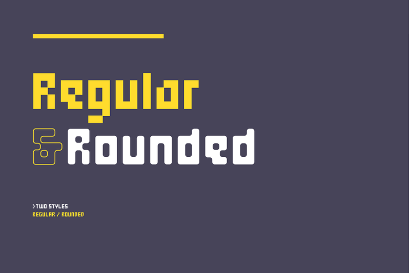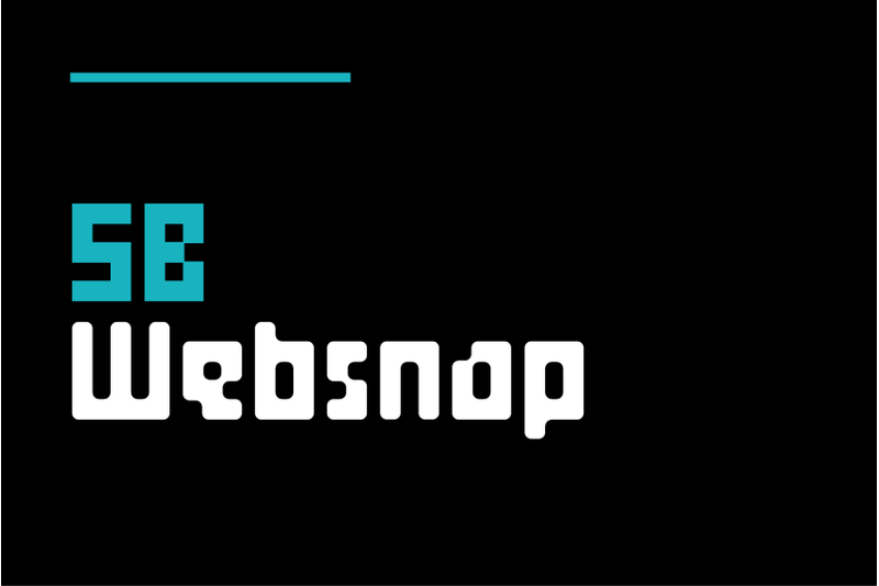
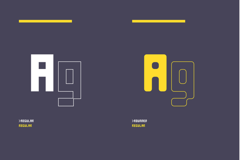
SB Websnap is a pixel font designed to be legible at very small sizes. Although SB Liquid and SB Message both found uses online, SB Websnap was the first SelfBuild Type Foundry typeface designed specifically for screen. It was designed primarily for small text, such as copyright and photo credits, legal disclaimers, or on banner adverts where space is limited. The grid used for the design is the minimum possible for a pixel font with good legibility, with a capital height of just five pixels. The typeface is optimised for use at 10px. The first version of this typeface was a capital-only font, but lower case letters and additional glyphs were later added. SB Websnap was designed for use in pixel graphics and as a Flash compatible pixelfont, both of which were popular as designers experimented with ways to improve the way the web looked and functioned. Later, a rounded version of the original pixelfont was added, opening up it to use as a headline typeface for today’s high-DPI screens.
Download SB Thorax Fonts Family From SelfBuild Type Foundry
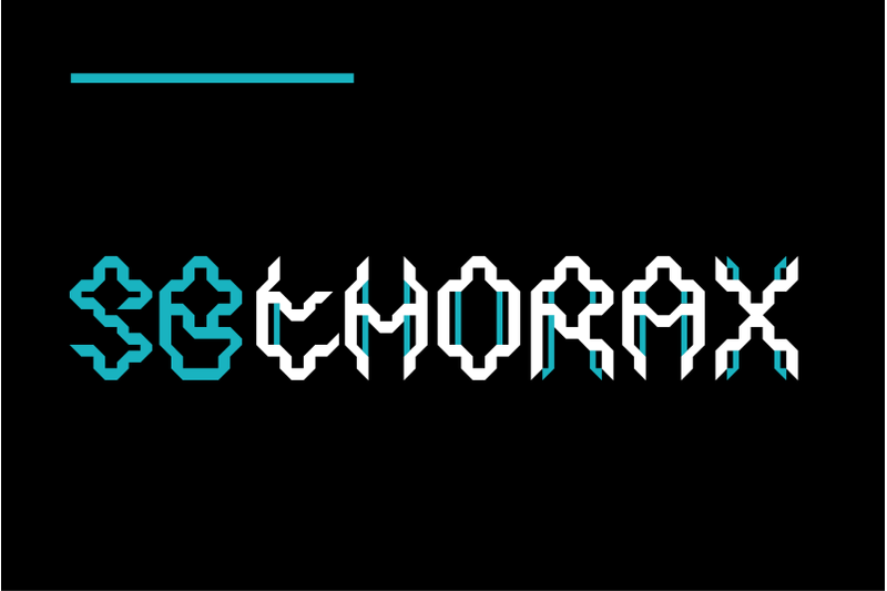
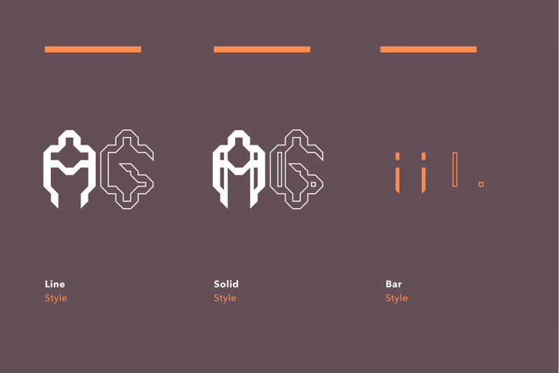
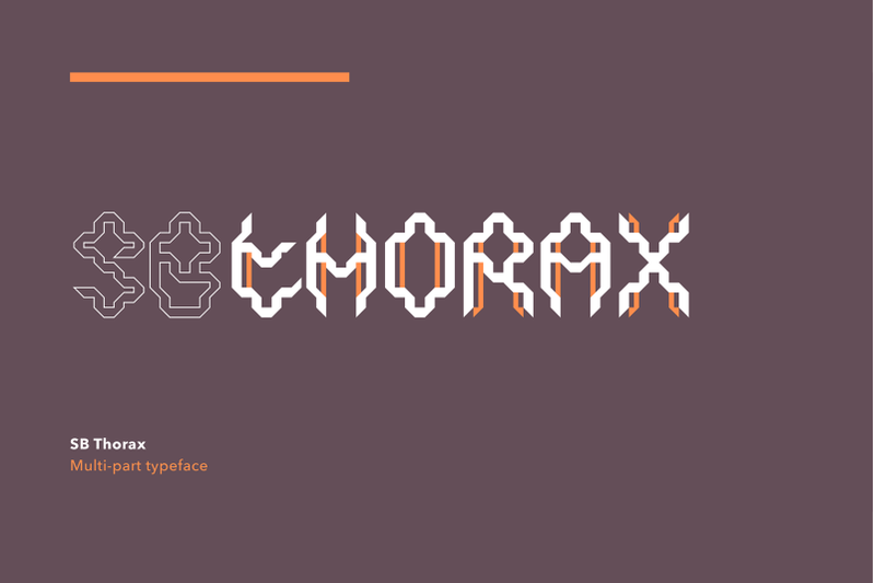
SB Thorax is a futuristic, angular typeface with strange, blackletter influenced letterforms. It is based on a triangular grid and has a distinctly alien, insectoid flavour that makes it well suited to science fiction, gaming and technology themed projects. This capitals-only typeface consists of three styles which are designed to be combined and layered with one another. Overlaying the base font with other versions of the font allows the designer to create letterforms with different coloured sections or different transparencies. SB Thorax can be categorised as a decorative display typeface and its unusual, detailed and often difficult to read letterforms mean it is best suited for poster headlines and other uses where a distinctive style is preferred in order to create maximum visual impact.
Download SB Sonar Fonts Family From SelfBuild Type Foundry
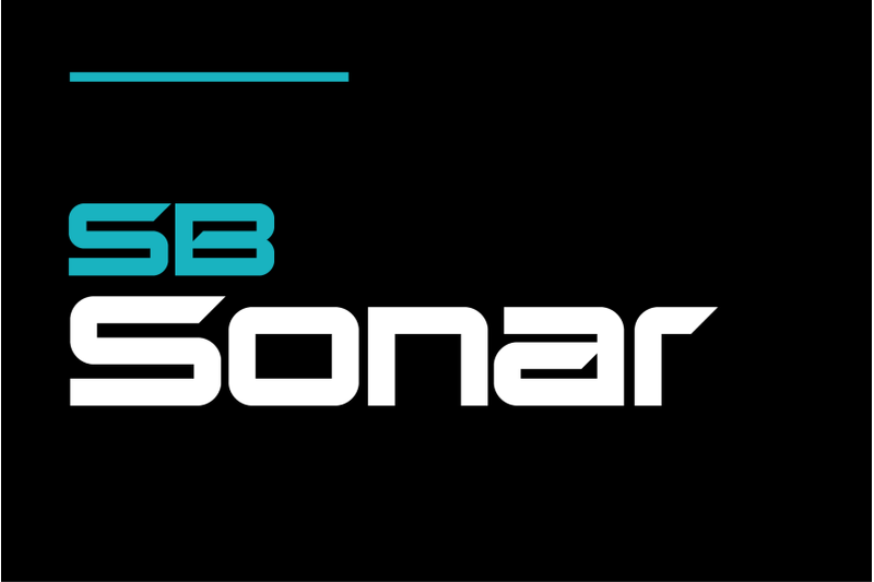
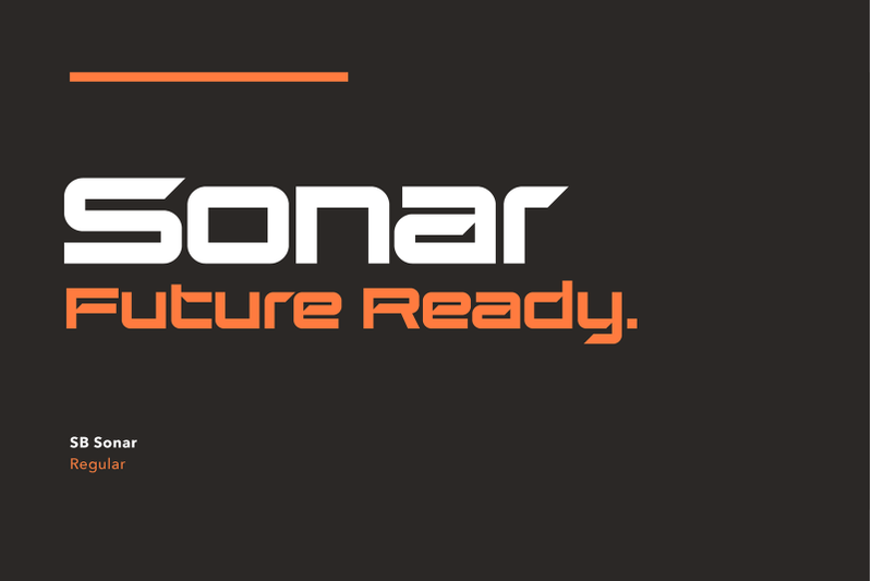
SB Sonar is a heavy, wide, rectangular typeface with sharp, angular features. It has a futuristic edge and works nicely as an alternative to Eurostile, perhaps for a gaming or sports themed project. While it takes its inspiration from the high-tech graphic language of science fiction films, it still retains some retro appeal and could easily have been taken from VHS tape packaging from the 1980s. SB Sonar is designed primarily as an impactful headline typeface for use in magazines, posters and logos. Its modern, mechanical looks make it a good match for electronic or audio devices or projects that require a technological feel, perhaps with a slight retro-future twist.
Download SB Raster Fonts Family From SelfBuild Type Foundry
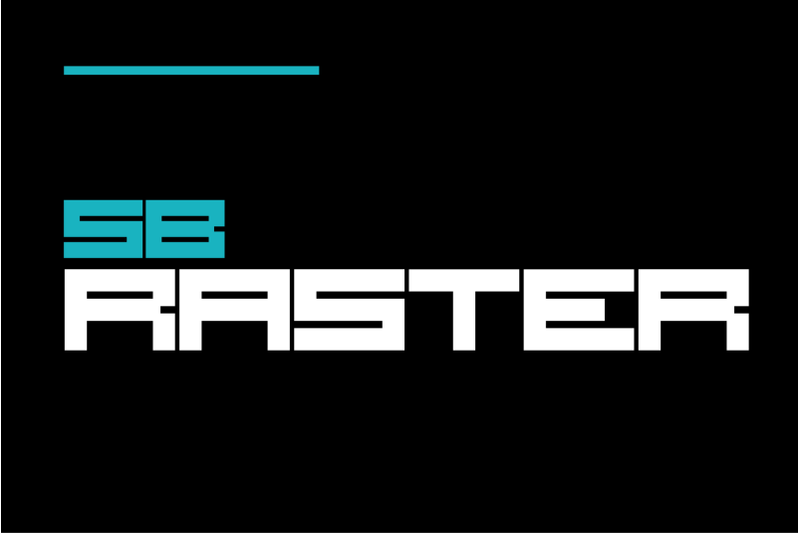
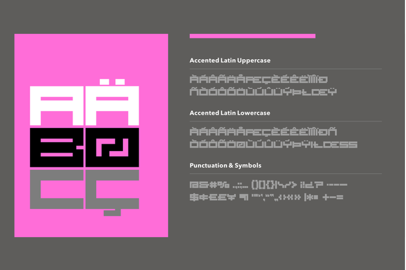
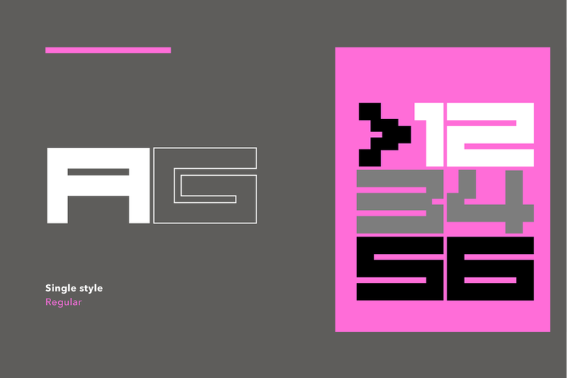
SB Raster is a blocky, bold, rectangular typeface with square pixellated corner details reminiscent of early videogame graphics. This capitals-only typeface started life as an extended pixelfont but as the design developed, it morphed into something with a more retro-digital arcade feel. The resulting typeface is well suited to anything related to retro computing, 8-bit consoles and game graphics. Its heavy, wide letterforms give it impact and it is best suited to display and headline use, perhaps on posters or as part of a logo. SB Raster has a strong retro flavour and works well at large sizes and in strong colours alongside similarly strong, geometric graphics.
Download SB Pixelpaint Fonts Family From SelfBuild Type Foundry
SB Pixelpaint is the result of delving back into the early pre-history of computer-aided graphic design, a time of bitmap graphics, floppy disks and black and white monitors. SB Pixelpaint is a collection of pixellated dingbats, arrows and tile glyphs designed to be used as repeating pattern fills, taking inspiration from the earliest computer paint programs, such as MacPaint and MS Paint. These programs allowed users to select an area of the artwork to fill with a pre-defined pattern fill, and these programs often offered a range of patterns for the user to choose from: checkerboard, stripes, a tiled roof or even a brick wall effect perhaps? SB Pixelpaint includes some of these pixelated tiles so you can experience the joy of using these early paint programs, but with the added bonus of being able to overlay and combine them using colour and transparency. Many of the glyphs in this font are designed to be used as pattern fills by repeating the same character, but you can create any combination you like. SB Pixelpaint is optimised for use at 10px. You will also need to set the leading to 10px and make sure the tracking is set to zero. This font also features a range of pixel-friendly dingbats and arrows, so it is recommended to use your application’s glyph picker to view the full range of tiles and symbols.
Download SB Phormic Fonts Family From SelfBuild Type Foundry
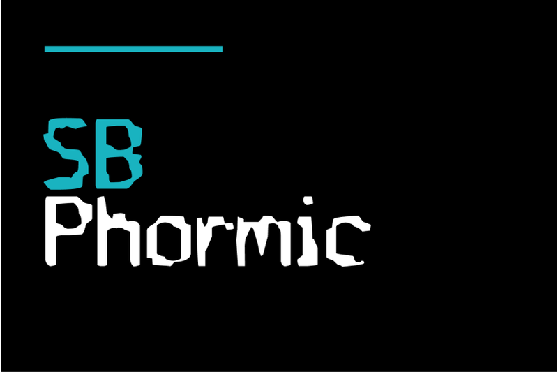
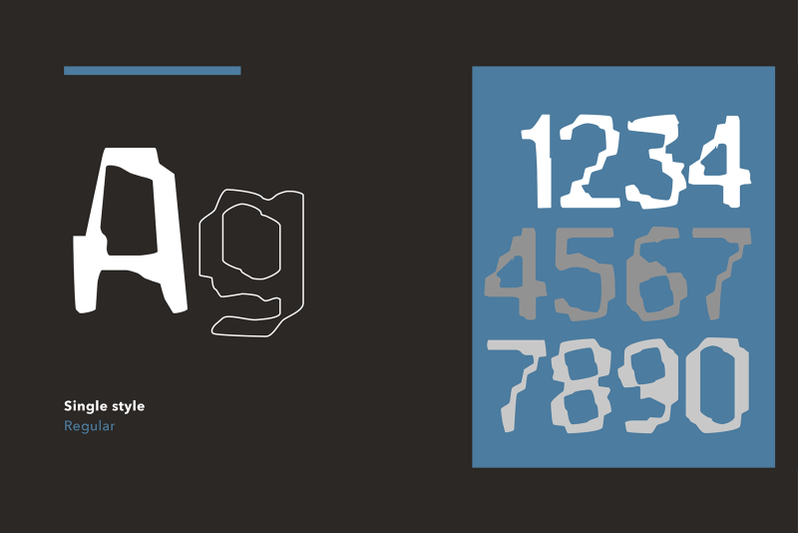
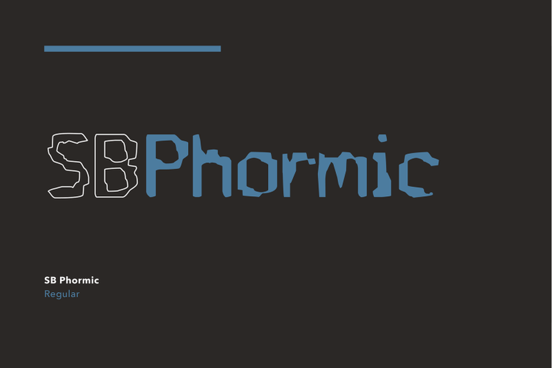
SB Phormic is a grunge typeface with hybrid DNA, spliced together from two other typefaces. Its genesis was the interpolation of SB Tokyo and SB Liquid, creating something new, yet strangely reminiscent of them both. The resulting letterforms have a distressed mechanical look, perhaps like something you might find on the output from a fax machine or some other text generating machine. There are pixel like forms in there, but they appear broken and distorted, giving the impression of damaged electronics or corroded machinery. SB Phormic works well in these contexts, as a distressed typeface to convey the feeling invoked by seeing the decaying remnants of heavy industry or the technological scrapheaps of abandoned technology.
Download SB Navigator Fonts Family From SelfBuild Type Foundry
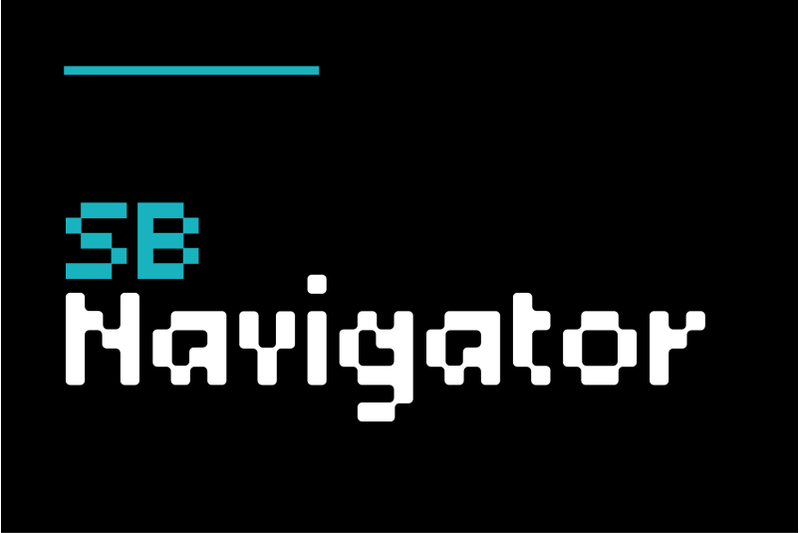
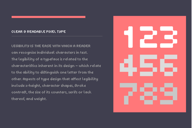
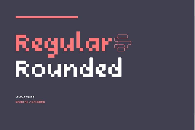
SB Navigator was designed for screen use, as a legible text typeface for use in website navigation menus. It was intended to be used as part of static pixel graphics or as part of a Flash animated menu, in the days when the web was a low-resolution experience, before webfonts became possible and when web designers were trying to find ways to push the internet forward from a design and usability point of view. SB Navigator also performs well as a text font, retaining good legibility at small sizes, thanks to lessons learned in the production of SB Liquid. It is optimised for use at 10px but can also work well at 20px. As a typeface it acts as a versatile alternative to the industry standard LCD font that SB Liquid is based on and would work well as part of an electronic display thanks to its clear letterforms. The family also features a rounded pixel version, opening it up for use as a headline typeface for high-DPI displays.